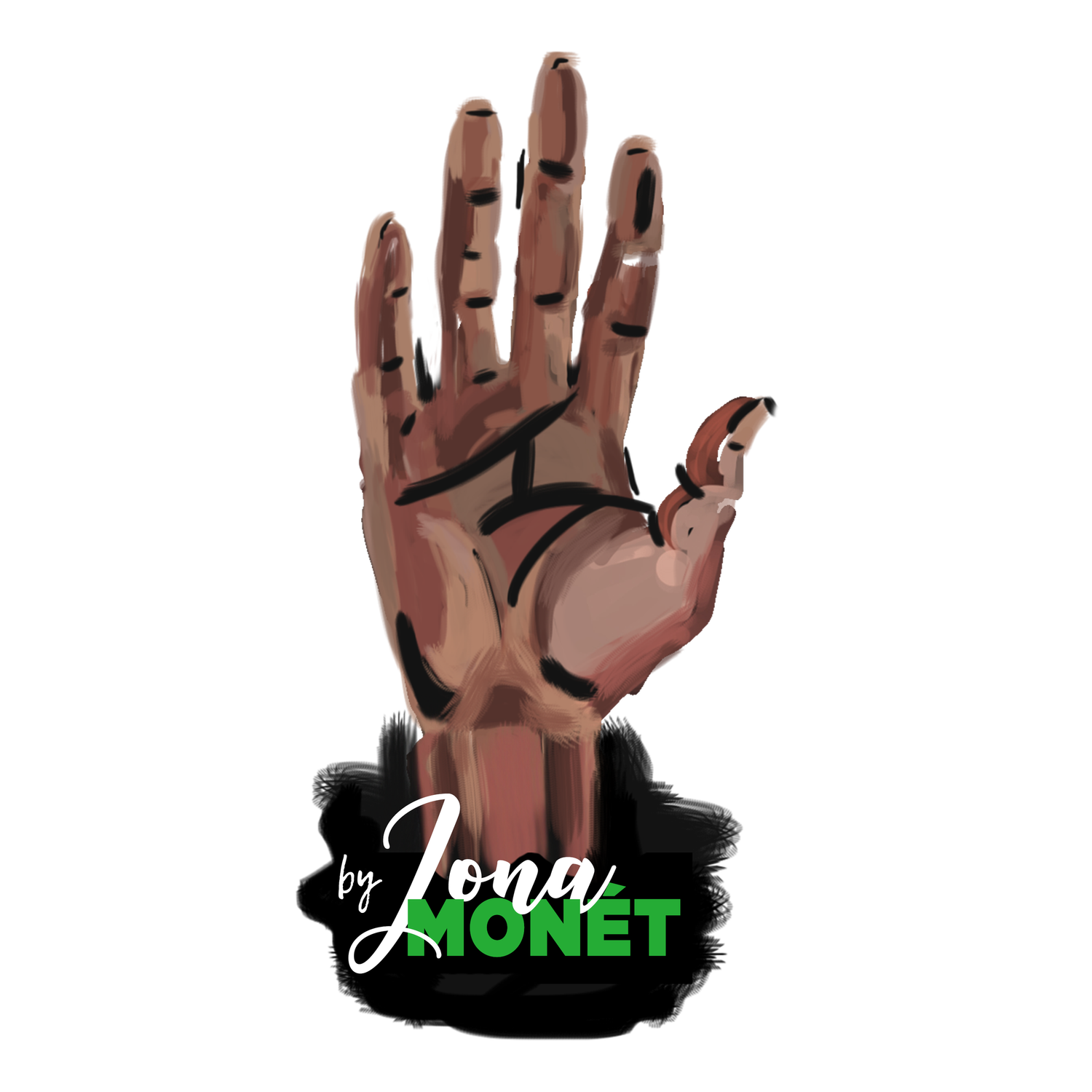


By Jona Monet
ART DIRECTION
Art Director | Paramount+, BET+
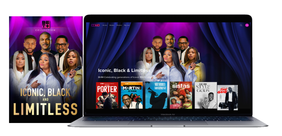
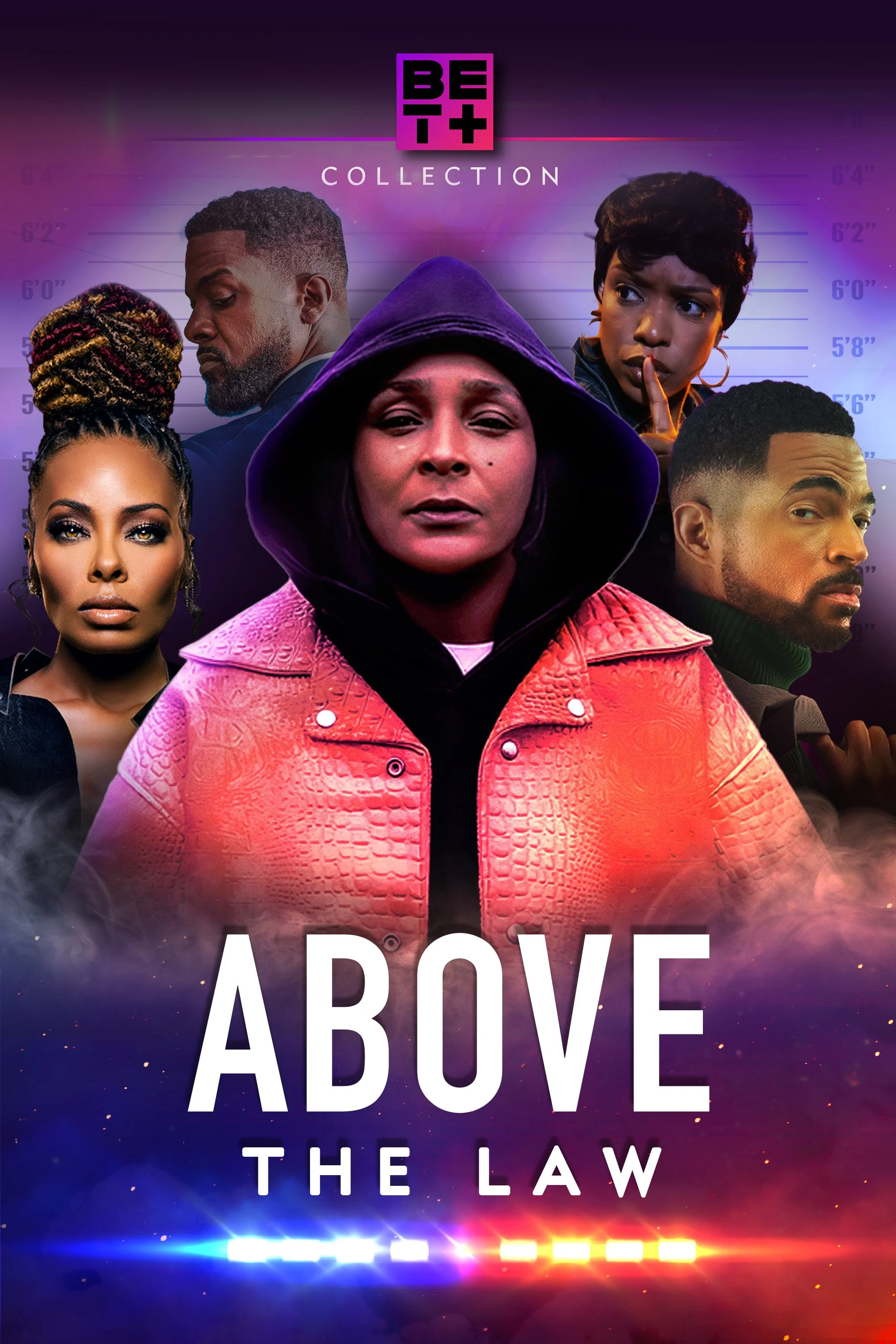
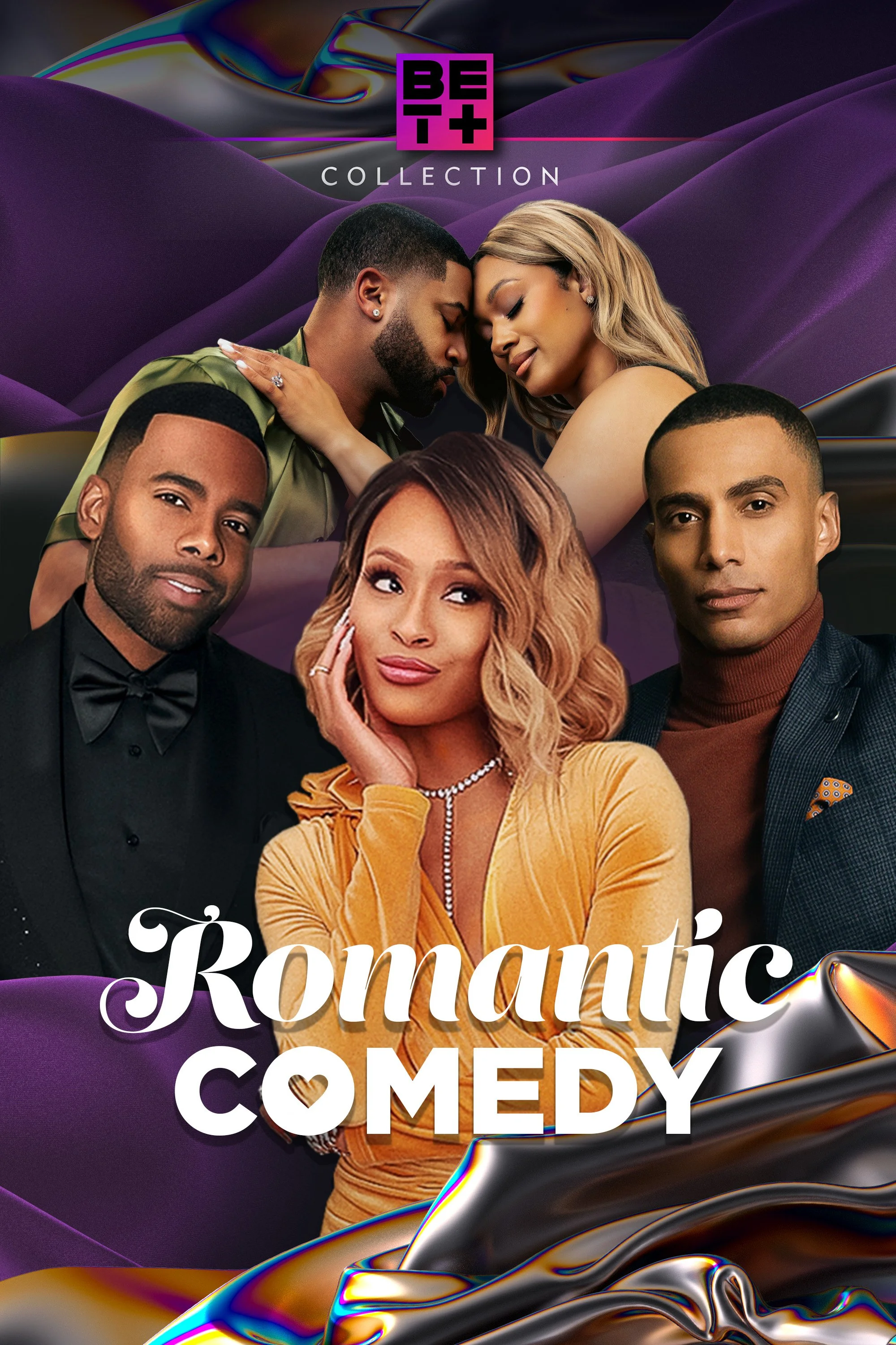
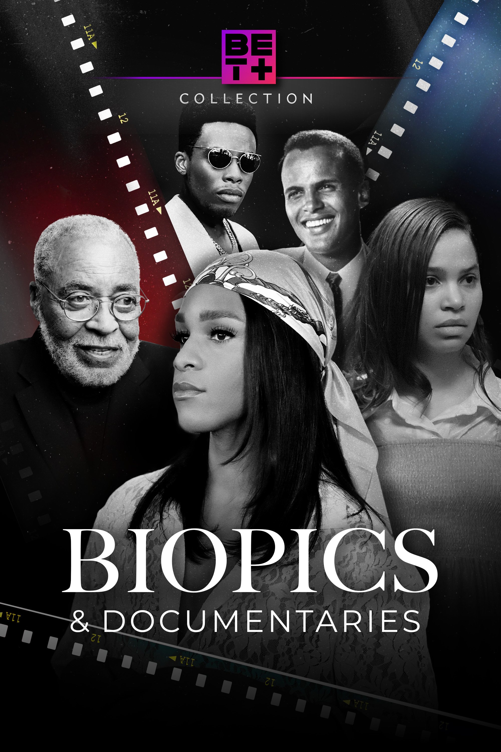
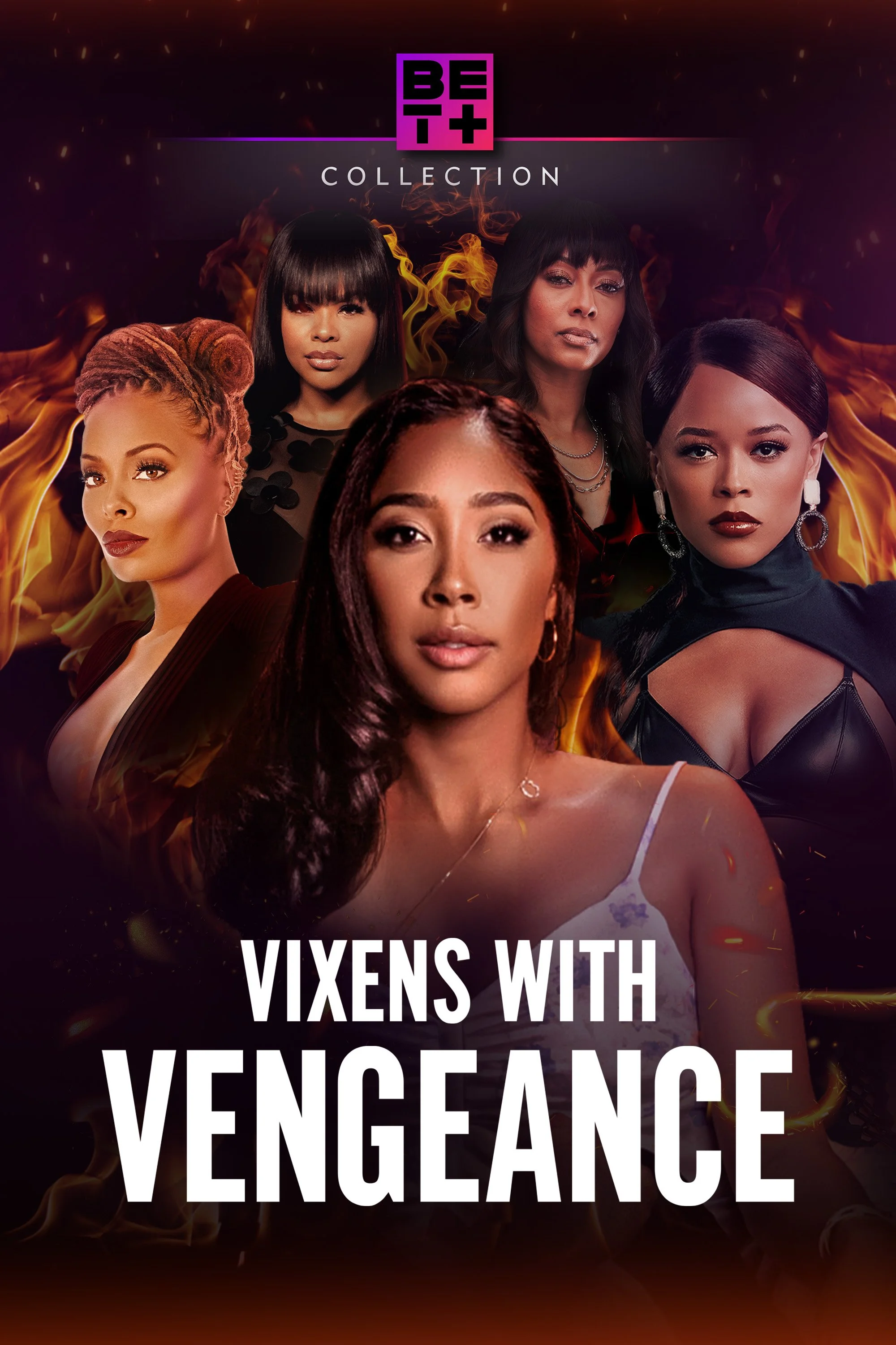
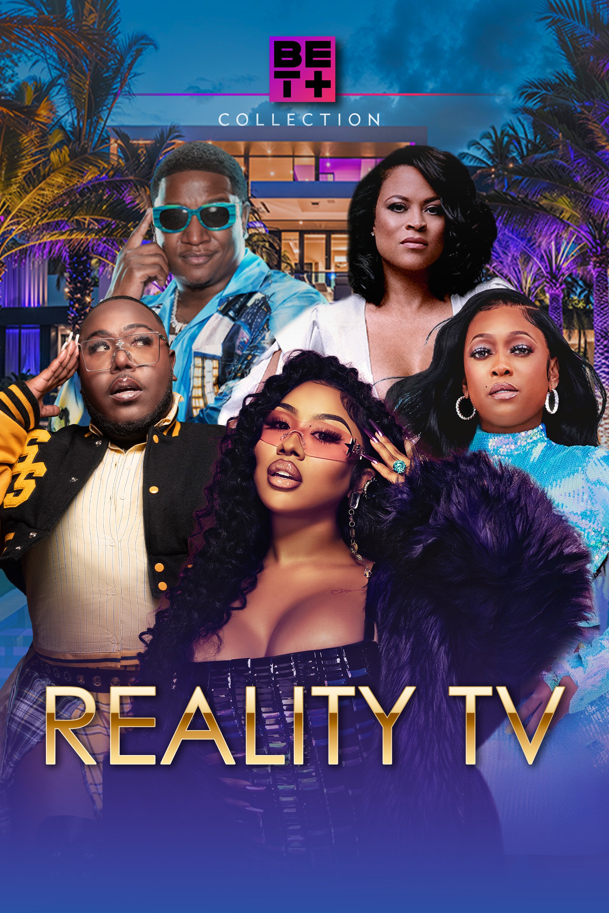
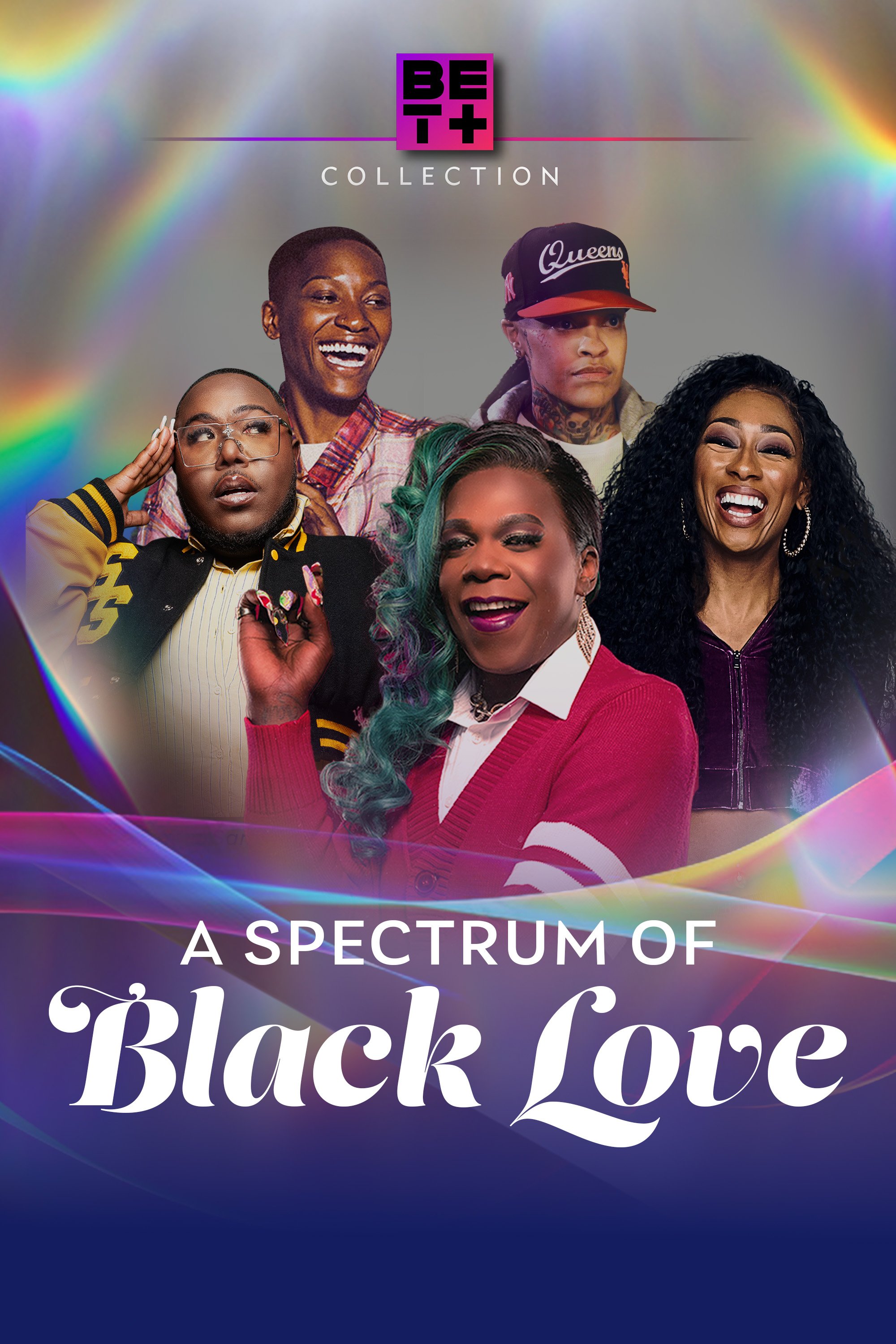
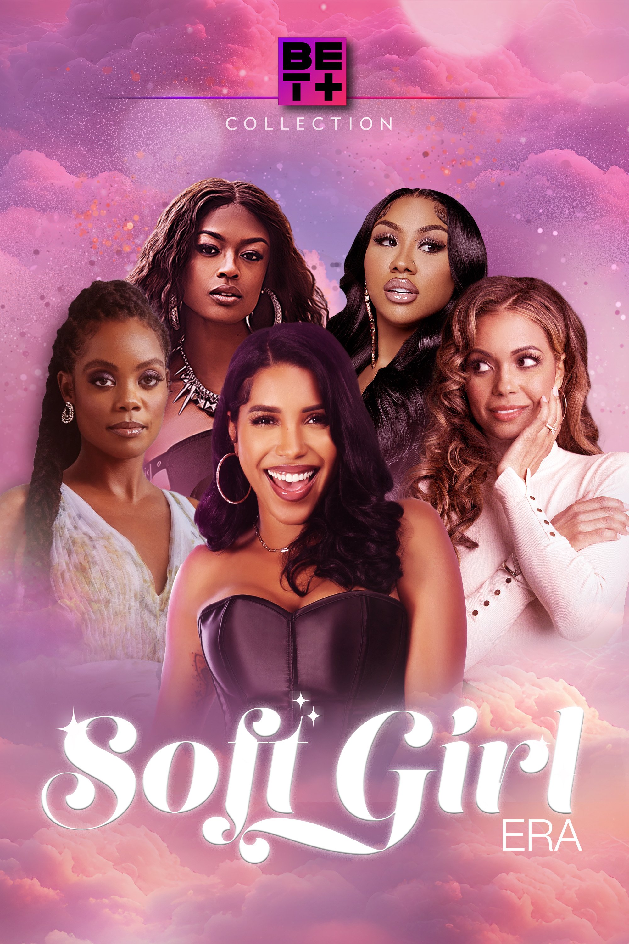
As an Art Director at Paramount+ and BET+, I lead the creative direction and visual consistency for our in-app experience and oversee the development of Key Art for external partners including Amazon, Apple, Roku, Dish, DirecTV, TiVo, and Gracenote. I collaborate with third-party advertisers to ensure all campaign assets are delivered on time and align with brand standards.
My role also involves working closely with directors and their teams to ensure that title rollouts are strategically executed and meet creative expectations across the board. Additionally, I concept and design original artwork for curated collections that elevate the BET+ brand experience.
Explore selected works below.


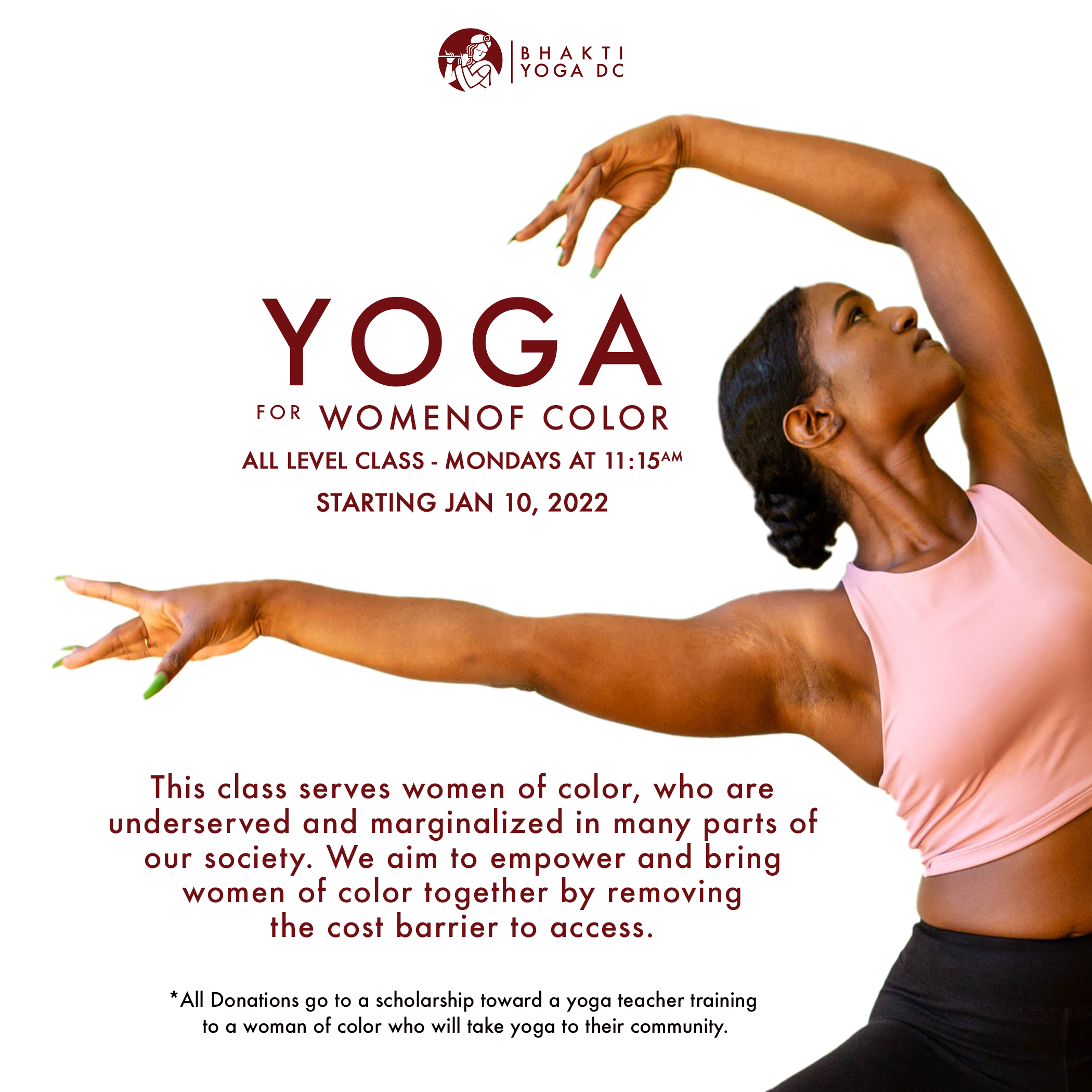
Graphic Designer | Bhakti Yoga
I created a series of social media graphics for Bhakti Yoga DC to promote an all-levels class specifically designed for women of color. The campaign highlighted accessibility, empowerment, and community, using clean layouts and impactful photography to emphasize inclusivity. These posts not only advertised the weekly class but also supported Bhakti Yoga’s mission to remove barriers to wellness by funding scholarships for future yoga teachers of color.


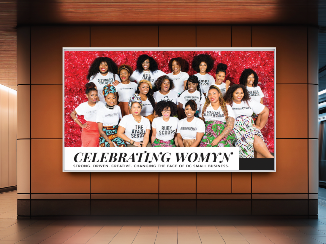
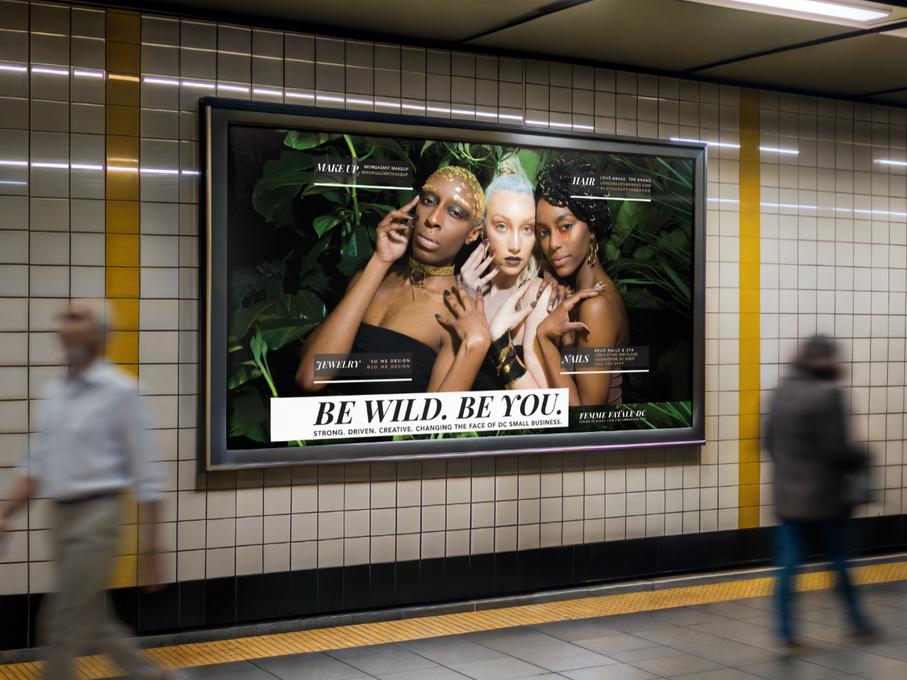
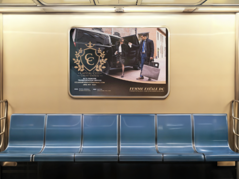
Graphic Designer | Femme Fatale DC
I designed a series of metro advertisements for Femme Fatale DC that spotlighted Washington, D.C.’s diverse small business community. Each campaign celebrated local entrepreneurs—ranging from beauty and wellness brands to luxury services—through bold imagery, layered typography, and strong brand storytelling. These ads, displayed across the city’s transit system, elevated visibility for women- and minority-owned businesses while reinforcing Femme Fatale’s mission to showcase creativity, strength, and entrepreneurship in the nation’s capital.
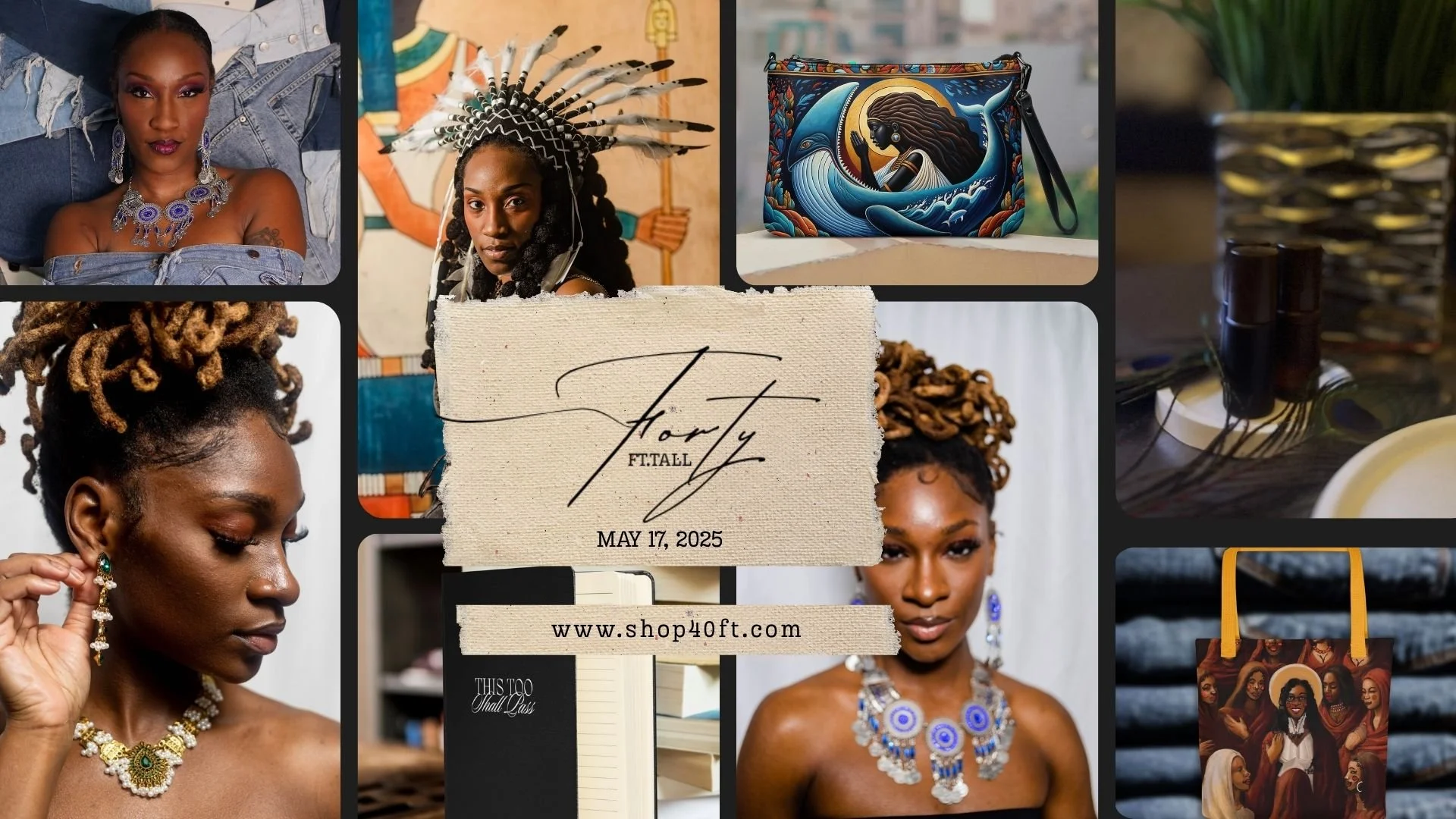
Founder | 40FT.TALL
40ft.Tall began as a way to honor what was passed down to me. My mother taught me to crochet, my grandmothers carried prayer and protection, and my father—before he passed—stood beside me as a model and believer in the vision. Rooted in my Gullah Geechee heritage, the brand carries the weight of swamps, stories, and survival. Every piece I design is meant to feel like a relic—something you inherit, carry, and pass on. My vision for 40ft.Tall is not just adornment, but ceremony: a living archive where jewelry and ritual objects hold memory, dignity, and the beauty of resilience.


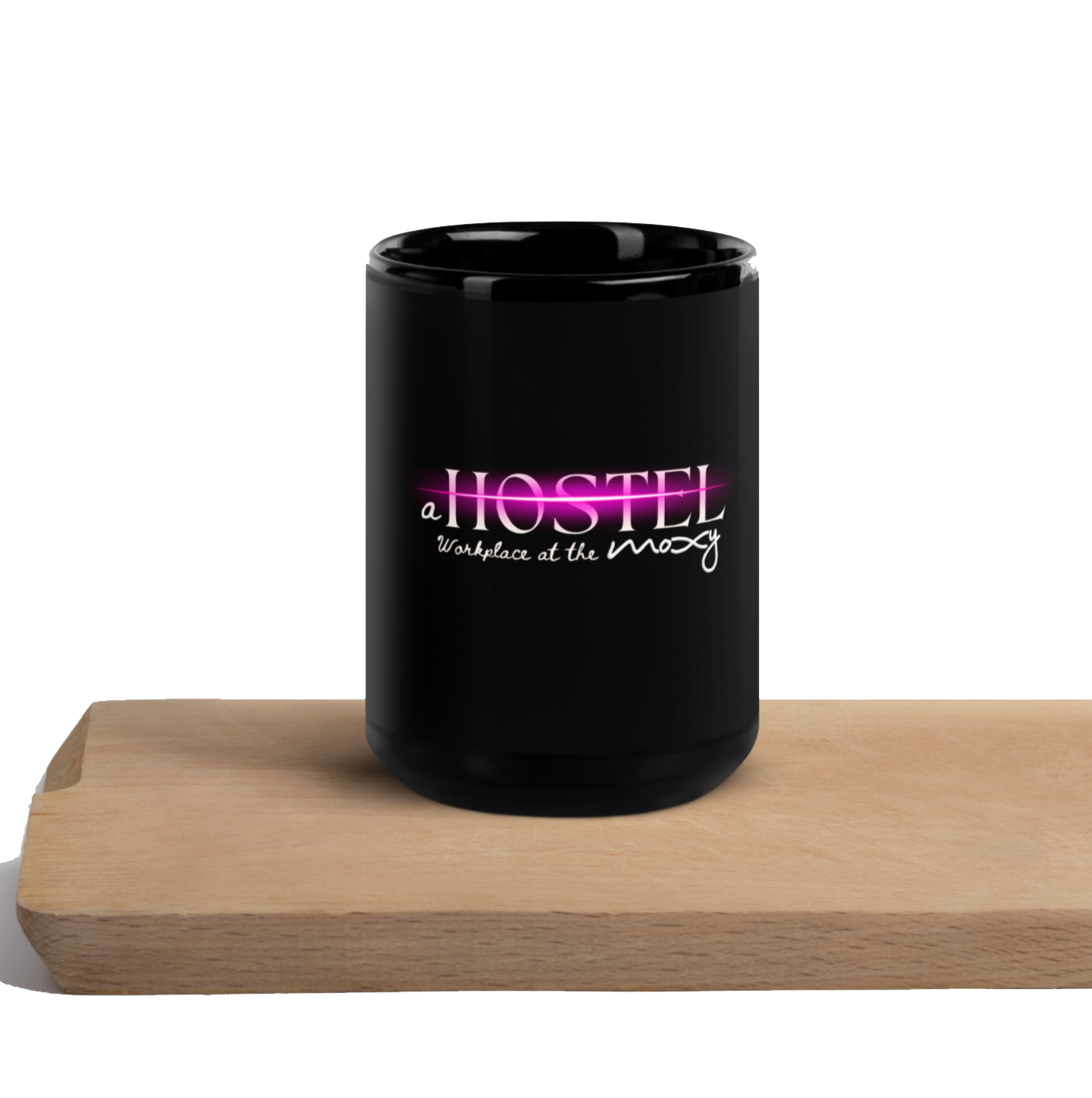
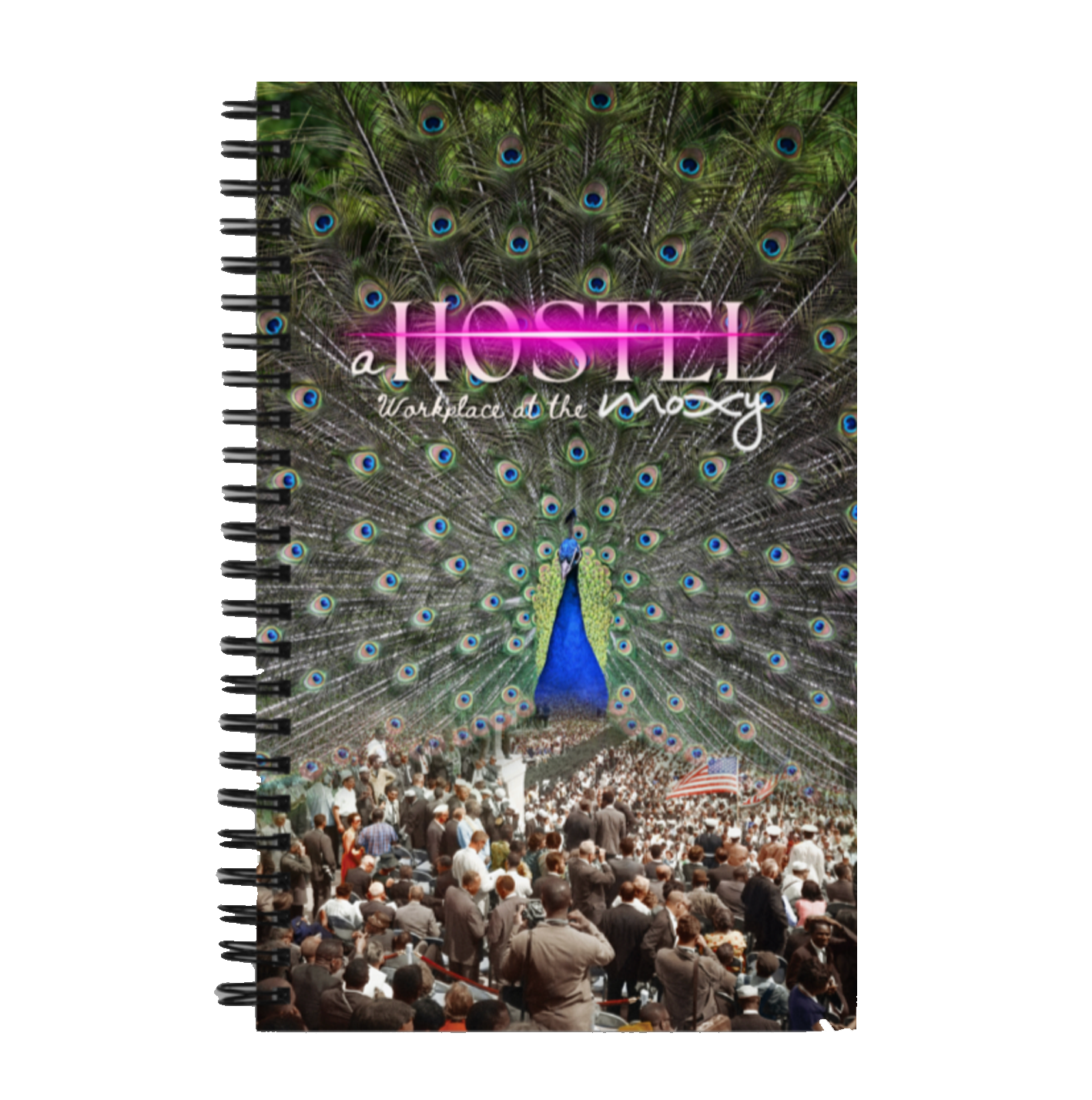
Founder | Hostel Workplace Coworking Day
During my time as an artist-in-residence with Mayor Muriel Bowser’s 202Creates Summer Residency (held during the height of the COVID-19 pandemic), I conceptualized and pitched Hostel Workplace—a pop-up coworking experience designed for creative entrepreneurs, digital nomads, and freelancers. The idea was selected and funded as part of our final project showcase.
With the support of 202Creates, I launched weekly coworking day meetups at hostel locations like Selina Hotel and Moxy Hotel in Washington, D.C. These gatherings offered artists and remote professionals a productive, inspiring space to work, connect, and collaborate—bridging community and creativity during a time of global isolation. I created the logo was was repurposed for both Selina and Moxy Hotel, which was used for social media, branding and merchandise.


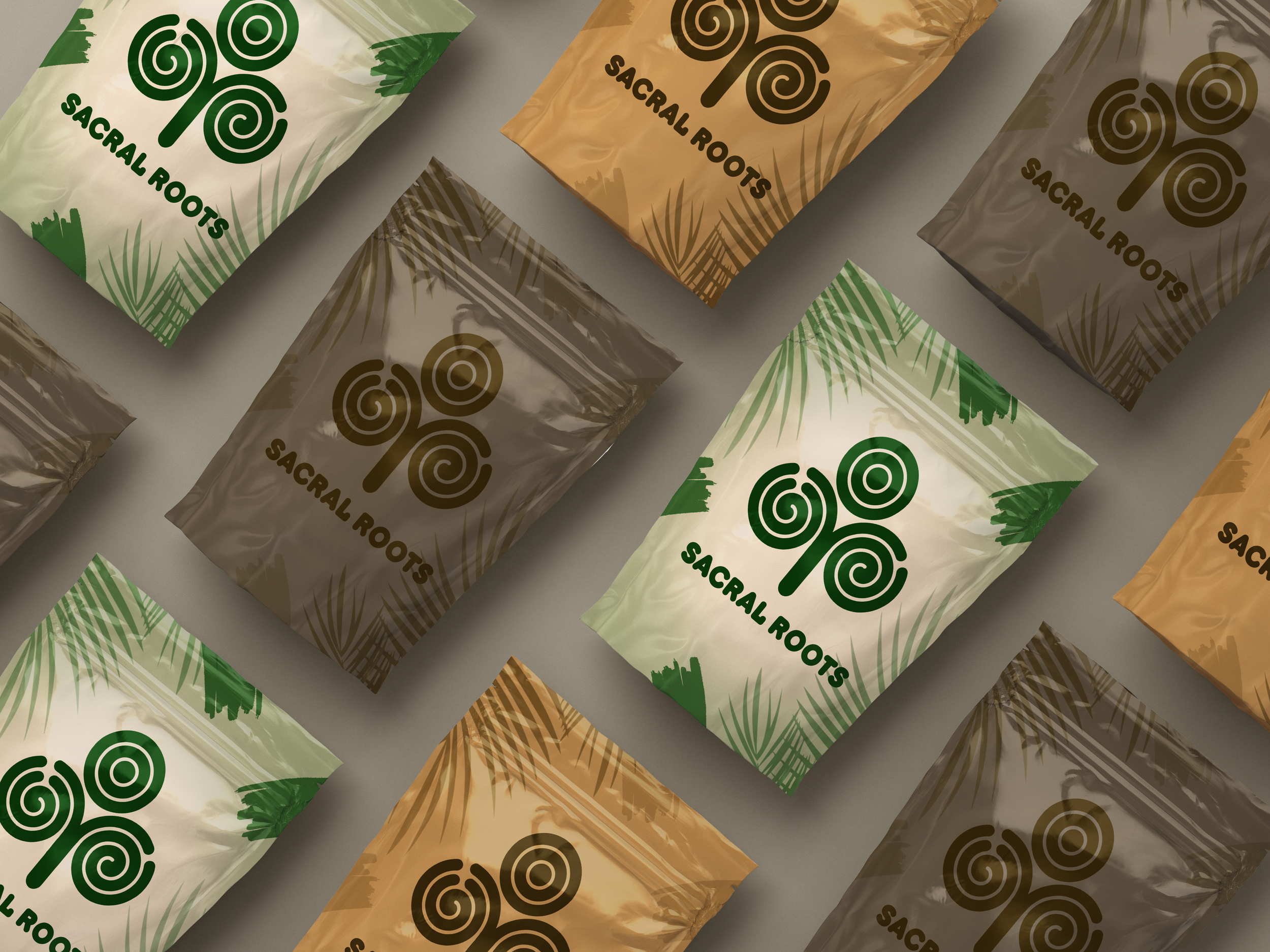
Brand Story | Sacral Roots
Root word: “sacral” from Latin sacer, meaning sacred or holy; connected to the sacrum, the base of the spine and seat of creative life force.
Sacral Roots was created to honor the deep connection between ancestry, healing, and growth. The logos reflect three expressions of this vision:
The Tree symbolizes legacy, family, and the grounding power of nature—roots spiraling deep into the earth while branches expand upward into possibility.
The Knotwork represents interconnection and community, inspired by sacred geometry and indigenous patterns. Each loop is a reminder that healing and heritage are continuous, woven together across generations.
The “S” Emblem distills the brand into a bold, modern mark, balancing tradition with clarity. The flowing curves evoke movement, breath, and energy—echoing the sacral chakra as the center of creativity and life force.
Together, these designs embody what Sacral Roots stands for: a sacred grounding in heritage, a flourishing of creativity, and a commitment to balance between the past and the present.

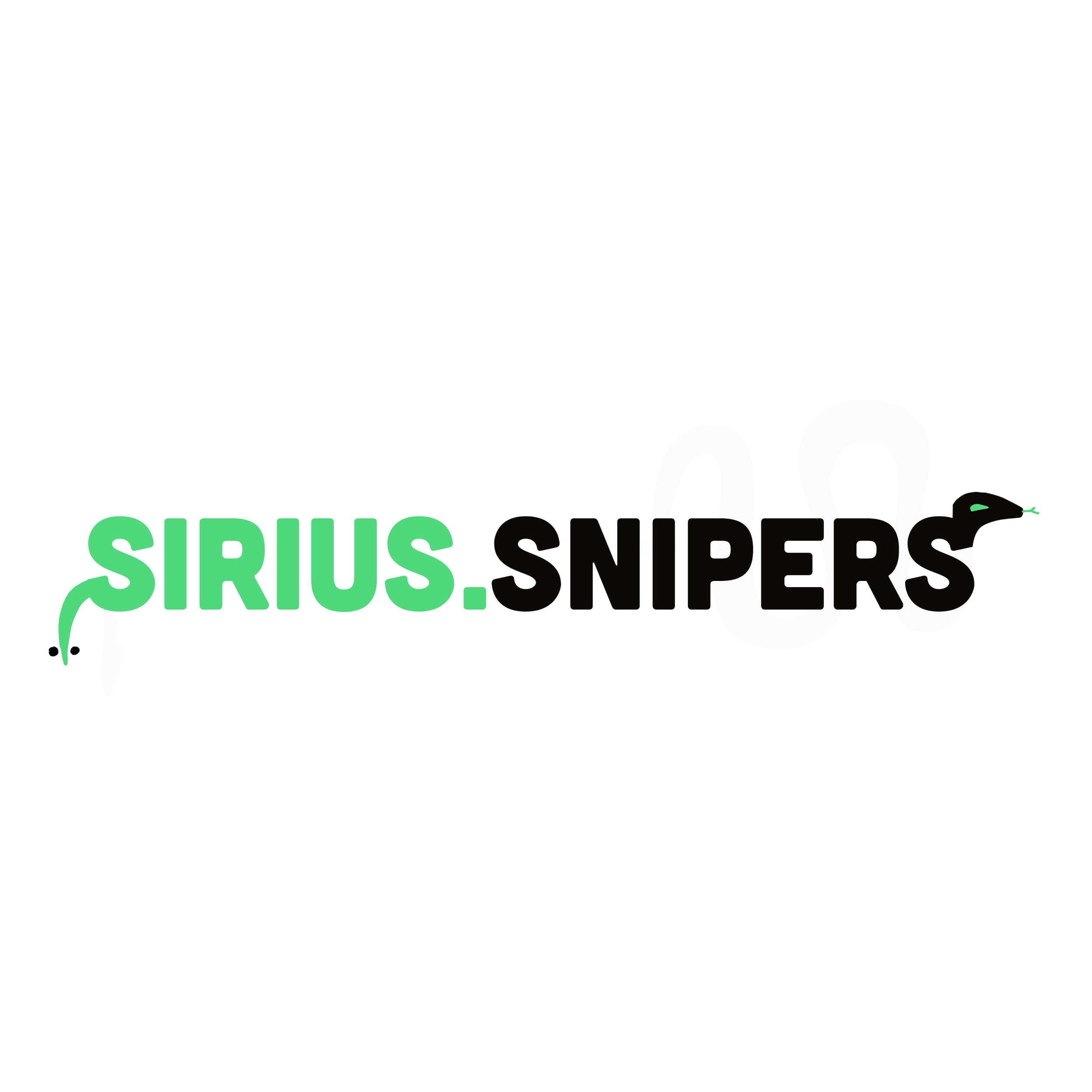
Brand Identity | Sirius Snipers
Root word: “Sirius” from Greek Seirios, meaning “glowing” or “scorching,” the brightest star in the night sky; “Snipers” from Old Norse snipa, meaning “to snipe/strike with precision.”
Sirius Snipers was born out of the need for clarity, precision, and guidance in the world of Forex trading. Like the star Sirius—the brightest point in the night sky—we aim to be a guiding light for those navigating the often-intimidating world of financial markets.
The serpent-inspired logo embodies agility, patience, and strike precision—qualities every successful trader must master. Just as a sniper studies the landscape before making a single, calculated move, our approach to trading emphasizes discipline, timing, and accuracy over impulse.
I was hired to create this Brand Identity that was used for social media and merchandise.